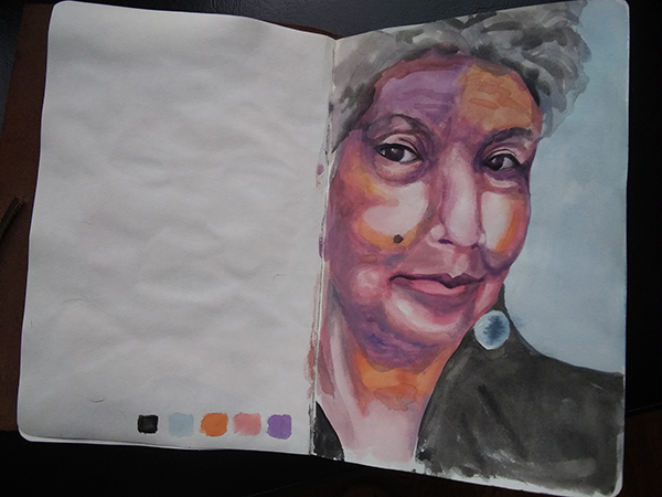
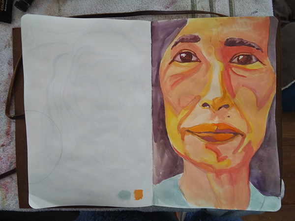
color study

composition study
color studies in gouache
sketchbook

large sketch
finished sketch


pondering creativity, process, and making art
color study
composition study
color studies in gouache
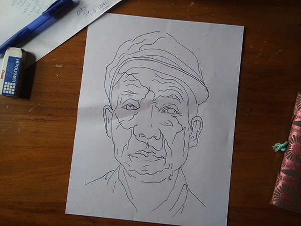
sketchbook
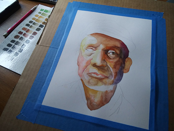
large sketch
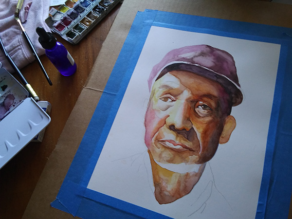
finished sketch

I spent the evening drawing a dog portrait so since I already had my tablet out, hopped on Artprof’s livestream for this Draw Along.

Teddy
I spent last weekend doing watercolor and gouache portraits but funnily enough, I could tell that what influenced me the most on the eye study was working on Teddy. I used a watercolor brush for the dog and the Michael Adamidis oil brushes for the eye study but I can tell that drawing and painting a little bit every day has really increased my comfort level and my facility with the forms and structures, regardless of medium.


Warm, “tropical”

To test with portraits
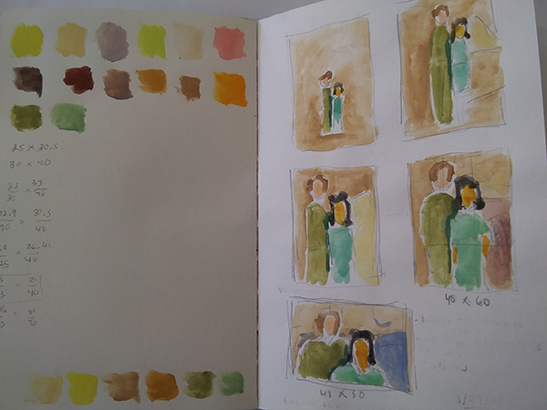
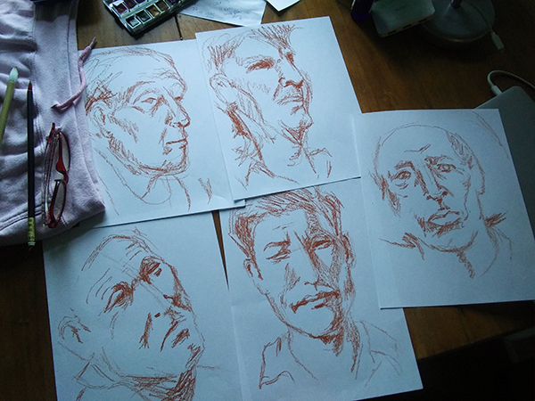
How loose do I want to do portraits? I did a series of “sketches” yesterday to play around with that but also decided to explore several color palettes and mediums (oil pastels versus pen versus straight up gouache).

I really like this palette but not sure I liked the oil pastel lines. I like the color. Maybe if my sheet is bigger so the lines are not so big relative to the composition.

I love the colors (the balance of yellows and blues) but the linework feels contrived.

I didn’t like my color selection — it’s too real, too hot… but I really like the structure of the face.

I liked the drawing when I did it and i LOVE this palette but I don’t like the inked lines.
I liked the size of this one — I feel like I had enough room to be more relaxed about the strokes. And the color palette is great too. I took what I learned from the previous ones and applied it to this one.
It’s not just Wes Anderson that uses color intentionally. 🙂 I’ve started paying much more attention to color palettes and what the filmmaker is doing. This choosing colors tutorial is helpful—the 60/30/10 rule. Just remembering to limit my palette to just a few colors will be a game changer.


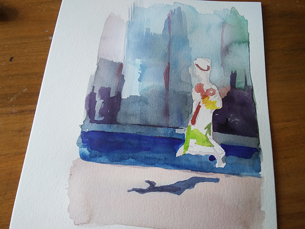
I’m on a roll. This time I’m following this tutorial. I picked it because I want to learn how to incorporated a background into the composition. This one appealed to me in how the artist represented depth of field. Also, I still want to loosen up my rendering style. The last one I did, I felt was too loose.
I don’t like this approach in that we’re starting and finishing areas of the portrait all at once before doing the next area. It’s hard for me not to build up the whole thing to see where I need to make adjustments as I go. Even though it looks okay, the process is very uncomfortable for me.
Oct. 22

Oct. 21

Oct. 20
I followed this tutorial, although how to paint wrinkles aren’t what I got from it. I was looking for a way to loosen up my portrait rendering. I did this all in one day and forgot to take wip shot so here it is…

What I learned:
I like that it was looser but I don’t like that it’s “sketchier” — I want it to feel more substantial. It was a good exercise in that I’m much more comfortable doing portraits, not because it’s good as much as I know that if I mess up, I can just make another one. Maybe after 10 more of these, they will lose their preciousness.
Oct. 20: done!

Oct 17

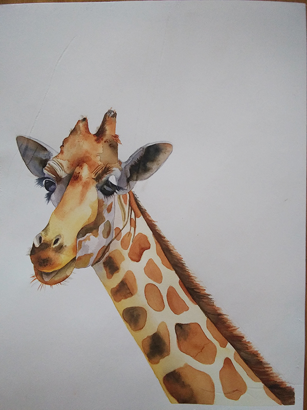
oct 10: giraffe head

sept 30: initial wash

sept. 28: ink drawing
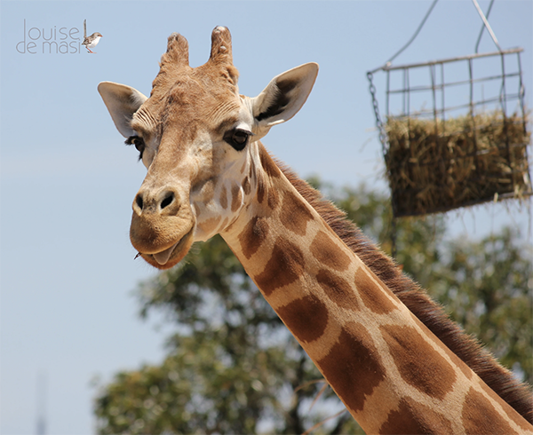
Louise de Masi’s reference photo
Starting another Louise de Masi class this week. Stepping it up one notch and used the reference photo to freehand sketch instead of tracing her line art. Not that it matters that much but there’s def some translation that happens there. I inked my sketch and now ready to trace this to my watercolor paper.
paper: Fluid 100% cotton, 140 lb.

Now, I really want to do something different with my portrait backgrounds but I feel like they should be looser and I don’t know how to do that yet. A little searching on YouTube led me to Enjoy Art’s tutorial. I tried my best to follow along.

Documenting this stage to remind me that everything looks like crap at one point
What I learned:
Watched the Art Prof Livestream on backgrounds for portraits. We talked about where to find inspiration for backgrounds and how to be intentional about them.
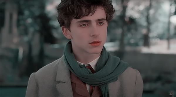
I also may have just watched Call Me By Your Name five times last weekend…


Alex turned me on to Malcolm Liepke…

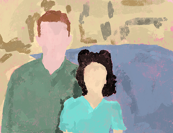
All of which inspired to revisit my earlier portrait study, Quaranteam and do some background studies. What works for me about this portrait is the composition. I love all the angles and just how weird and wacky they are. The dog is practically upside down! I definitely want to preserve that. But I’m not sure I need the specificity of the window or the couch, really.

I like the idea of blocks of color. I even like the sketchy-ness of seeing the pencil marks. I’m excited about the possibilities.
p.s. This video on Wes Anderson style is also helpful/interesting re: color theory. His hand is so over the top but it’s still “in the world” — that’s interesting to me.
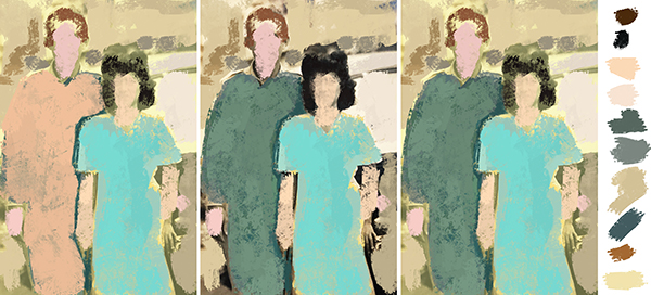
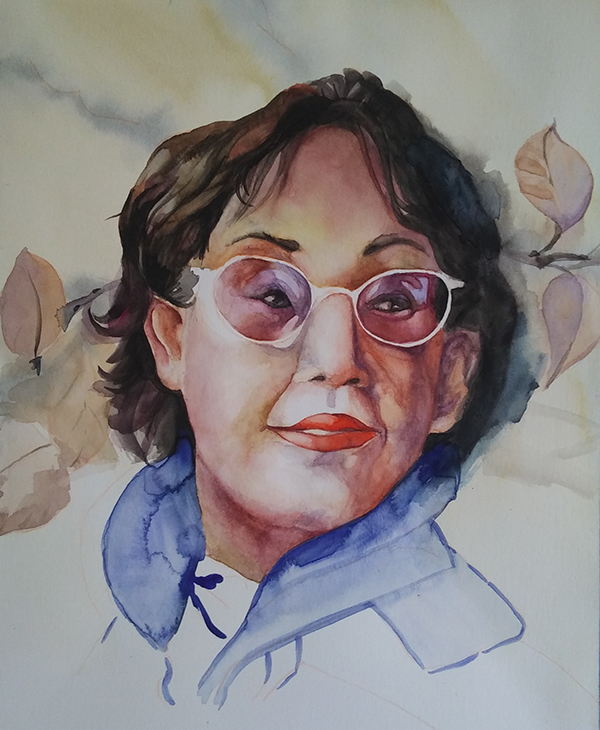
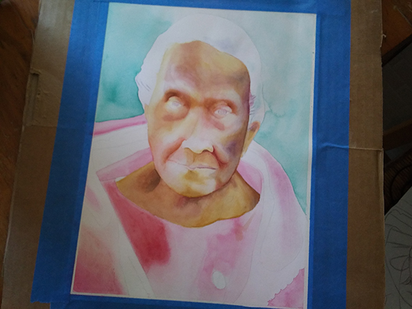
I started a new painting this weekend, building on what I learned from the last one. This time, I won’t have a step-by-step guide. I had to make every choice myself and I can see what Carol Carter was talking about in terms of painting being tiring. Definitely requires mental focus. I’m trying to keep in mind Carol’s advice on not making it precious. That’s why I picked Juliana — the composition is similar enough to the old man that I could borrow some of the techniques from the tutorial but more importantly, I don’t have an emotional connection to her so I won’t feel any pressure to make it match any personal memories I have.
I’m going to post my progress in reverse chronological order here, as evidence — for me to see all the awkward, terrible in progress phases where I want to throw it out. Regardless of how it goes, I’m committing to finishing it.
Some other things I’m exploring with this one:
What I’ve learned so far:

Too pink wth, still seems really washed out
structure is emerging


Experimented with metallic background and fixed shoulder
I followed along with Art Painting Workshop’s YouTube tutorial.
What a learned:
What I liked:
What I want to change:

Day 5: finished!

Day 4
Day 3
What’ I’ve learned so far:
Day 2: Really bummed I forgot to take a picture of the first wash
Lots of great reflections in this interview with Carol Carter:

Goldfarb 6b
Art Professor Shows How to Compose a Portrait
So many ways to open up narrative possibilities, even in just head, neck, and shoulders. Much much more than eyes, nose, and mouth.
5-min gesture drawings with Dr. Lieu in Art Prof’s Draw Along. Bottom center is 10-min.
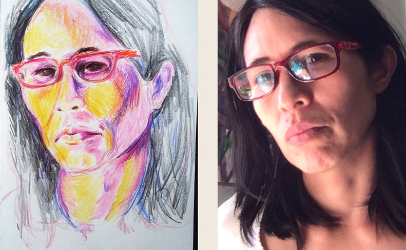
Arteza color pencils
Not used to considering color in sketches. Good exercise but what the heck with the eyes?!

Inked!
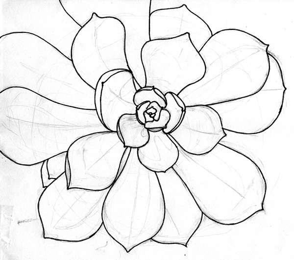
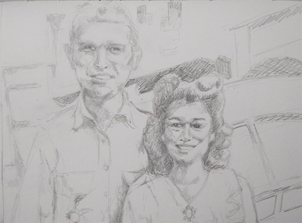
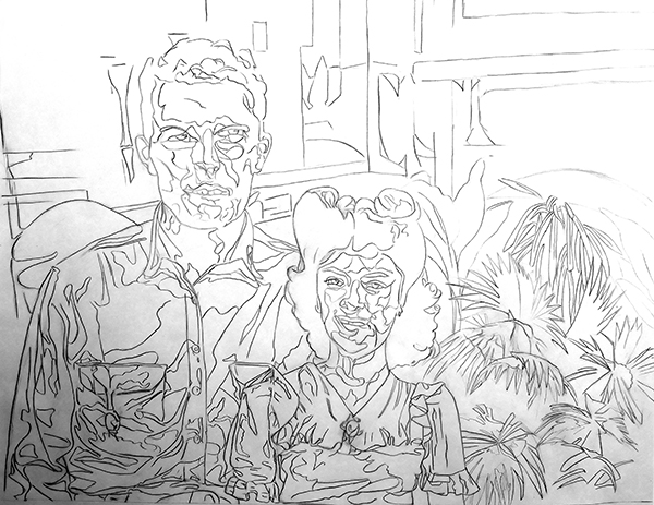
Serendipity! I stumbled on artprof.org and this lesson on portraiture just as I’m starting this series. Some reflections as I inked… I approached this drawing very much as a relationship between two figures. I did NOT start with the eyes, nose, and mouth (I had to think about that when Prof. Lieu asked in the video). I did it just like I did the succulent or the cow (posts to come). I go from big forms to small. So maybe I did learn something in Drawing 101.
Also, I’m excited to translate from picture to sketch to ink to watercolor. It’s like Sr. Sheila teaching us how to write a term paper — making notes, making notecards, and writing from there. I like the distance from the original, the opportunities to inject some sort of unconscious translation or stylization. It reminds me of how I had to plan out my printmaking projects.
Jordan Casteel. Great interview with the artist where she talks about her twin brother and representing Black men. Really big paintings. Yale and Harlem School
Faith Ringgold. She fights for women artists in the art world — we want 50% at the Whitney Biennial. Art is a visual image of who you are. That’s the power of being an artist.
Alice Neel. Love her quirky portraits — the proportions are all wrong, the perspective, the expressions!
Mark Tansey. A Gagosian artist. Monochromatic — like ONE c0lor! Huge paintings. Example: The Key — a retelling of the story of Adam and Eve getting kicked out of Eden.
No shortcuts! I’m becoming aware of my tendency to punt something down the field…
I’ll deal with that later. I’m going to stop doing that because it just aggravates the problem later. I’m going to deal with it now, assessing whether I am happy with the execution of this piece right here in the sketching stage before I move on — are the expressions the way I want them? The hands? Etc. I will not assume I can fix it in the painting stage.
This is where the translation from a photograph to artwork happens so am I happy with it? I’m not projecting and tracing. I’m actually drawing — intentionally. I don’t want it to look like I traced it. I want something to happen in between those two states. Do I like the translation?
Also at this point, do I have enough data so that I can paint it well? Do I need to add more cues that will help me later?

Initial sketch
There’s something wacky going on with the right hand. Re-drawing that before I ink.
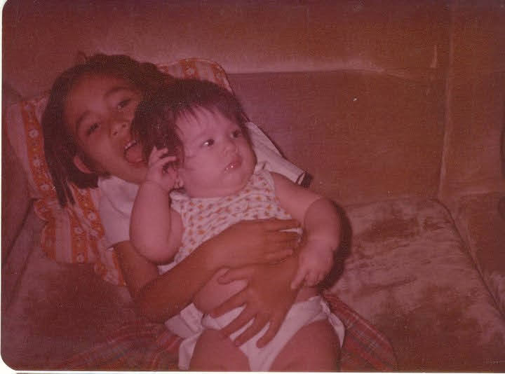
Reference photo
Some hacks I’ve come up with so far: