
Warm, “tropical”

To test with portraits
pondering creativity, process, and making art
Warm, “tropical”
To test with portraits
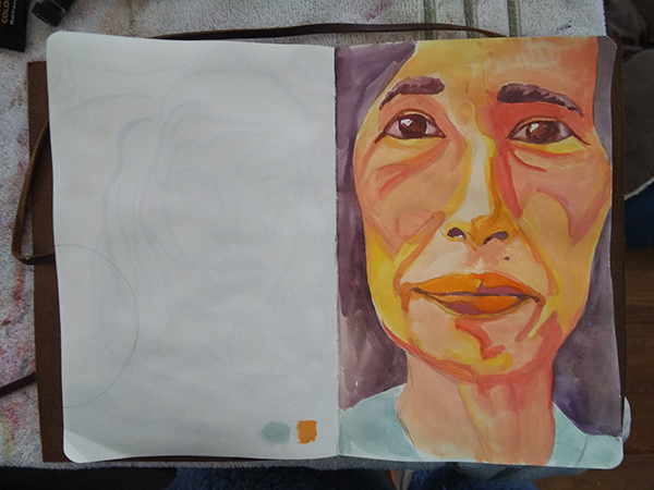
How loose do I want to do portraits? I did a series of “sketches” yesterday to play around with that but also decided to explore several color palettes and mediums (oil pastels versus pen versus straight up gouache).

I really like this palette but not sure I liked the oil pastel lines. I like the color. Maybe if my sheet is bigger so the lines are not so big relative to the composition.

I love the colors (the balance of yellows and blues) but the linework feels contrived.

I didn’t like my color selection — it’s too real, too hot… but I really like the structure of the face.

I liked the drawing when I did it and i LOVE this palette but I don’t like the inked lines.
I liked the size of this one — I feel like I had enough room to be more relaxed about the strokes. And the color palette is great too. I took what I learned from the previous ones and applied it to this one.
It’s not just Wes Anderson that uses color intentionally. 🙂 I’ve started paying much more attention to color palettes and what the filmmaker is doing. This choosing colors tutorial is helpful—the 60/30/10 rule. Just remembering to limit my palette to just a few colors will be a game changer.


Watched the Art Prof Livestream on backgrounds for portraits. We talked about where to find inspiration for backgrounds and how to be intentional about them.
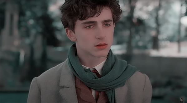
I also may have just watched Call Me By Your Name five times last weekend…


Alex turned me on to Malcolm Liepke…

All of which inspired to revisit my earlier portrait study, Quaranteam and do some background studies. What works for me about this portrait is the composition. I love all the angles and just how weird and wacky they are. The dog is practically upside down! I definitely want to preserve that. But I’m not sure I need the specificity of the window or the couch, really.

I like the idea of blocks of color. I even like the sketchy-ness of seeing the pencil marks. I’m excited about the possibilities.
p.s. This video on Wes Anderson style is also helpful/interesting re: color theory. His hand is so over the top but it’s still “in the world” — that’s interesting to me.
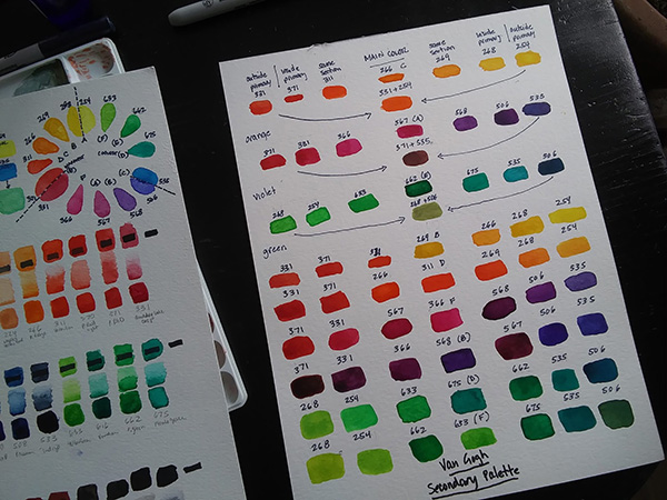
Secondary Colors (Dr. Oto Kano)
What I learned:
Just doing a lesson every day…
What I learned:
It’s been a minute.
I’ve continued with my daily at practice, although a lot hasn’t happened in a sketchbook. I designed a garden, renovated a house, learned how to bake sourdough (like the rest of North America). My house is in a constant state of being painted. Finally, I got the itch to get back to making personal art. And when I did, I found myself butting up against my abilities.
What does that mean? For a long, long time I felt at a loss for subject matter — what I wanted to address or focus on through my art. Finally, I have a lot to “say” but can’t capture it the way I want because I don’t have enough mastery of my tools. So I’m putting myself through DIY art school.
I’ve been painting forever but mostly in oils. In actual art school, I focused on printmaking. But for many reasons, watercolor feels like the best medium for me right now. Problem is, I’ve taking exactly ONE watercolor workshop in my whole life.
It’s fun being a beginner. Anything is possible! It’s that whole new-backpack-fresh-new-notebook-back-to-school feeling. 🙂 I’m just going to post here along the way, (really) to document this journey for myself. I could keep an actual notebook but I’m “traveling light” these days.

12-color split primary palette from the Van Gogh pan set
What I learned:
