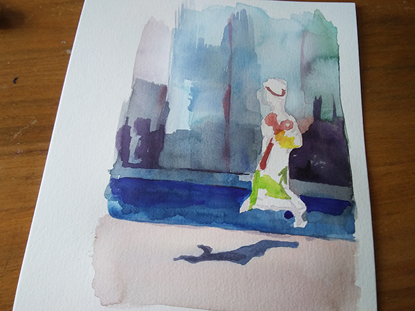
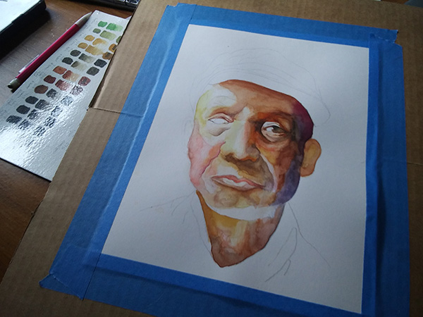
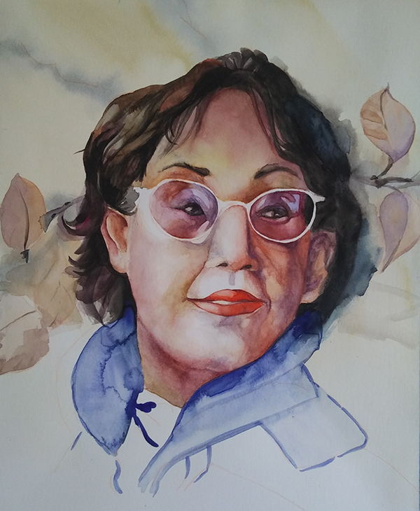
I’m on a roll. This time I’m following this tutorial. I picked it because I want to learn how to incorporated a background into the composition. This one appealed to me in how the artist represented depth of field. Also, I still want to loosen up my rendering style. The last one I did, I felt was too loose.
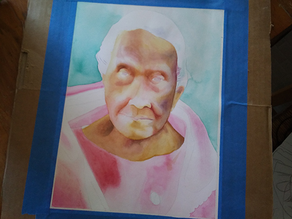
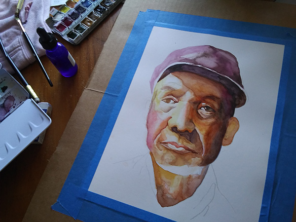
I don’t like this approach in that we’re starting and finishing areas of the portrait all at once before doing the next area. It’s hard for me not to build up the whole thing to see where I need to make adjustments as I go. Even though it looks okay, the process is very uncomfortable for me.
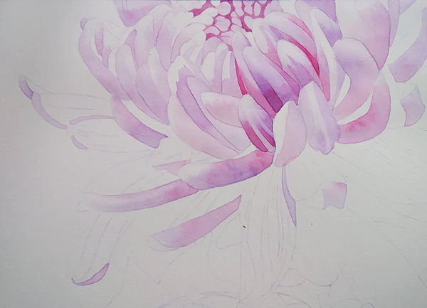
Oct. 22

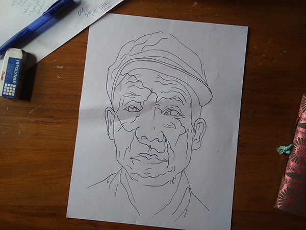
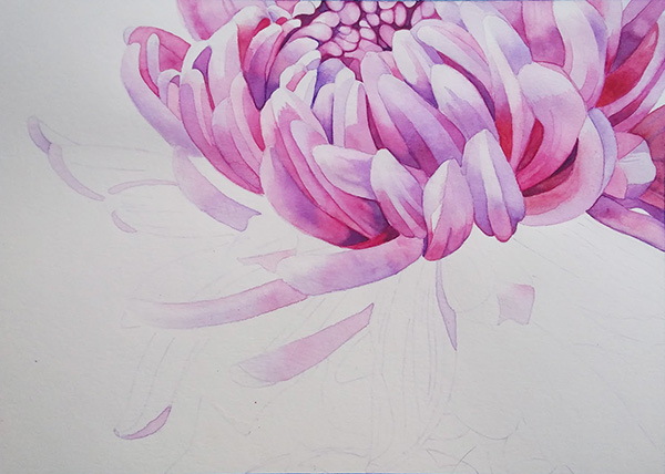
Oct. 21

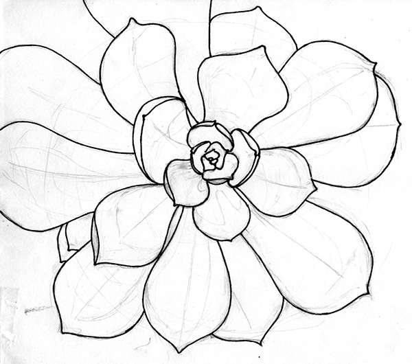
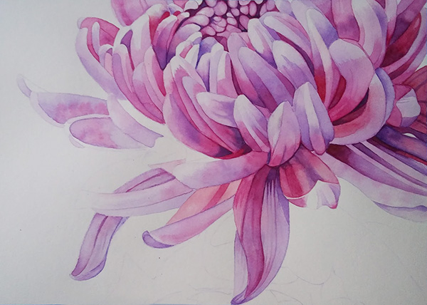
Oct. 20