
I’ve started using erasable markers on my palettes so that I remember what’s what. Assuming each painting takes at least two weeks, this system has been really valuable.
pondering creativity, process, and making art
by riasharon

I’ve started using erasable markers on my palettes so that I remember what’s what. Assuming each painting takes at least two weeks, this system has been really valuable.
by riasharon
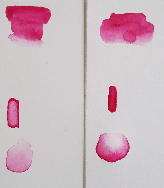
Left: Fluid 140 lb. 100% Cotton Hot Press; Right: Fluid 140 lb. Hot Press
by riasharon

If I’m being really neatnicky, I should test this technique with every paper and paint color.
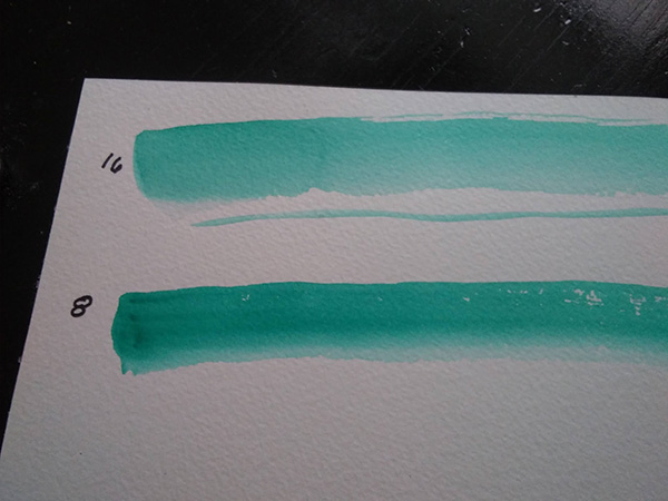
What I learned: it’s more challenging to do with darker colors — meaning more pigment.
by riasharon
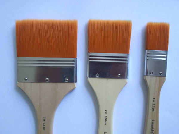
large wash brushes

ink brush set
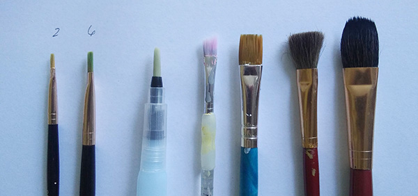
random brushes

round brushes

craft brush set
What I learned:
by riasharon
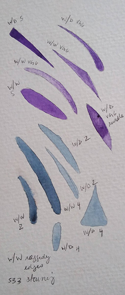
Prepping to paint the next stage of the Louise de Masi’s chrysanthemum. For adding detail, I’m testing out my #2, #4 in the ink brushes, plus the #5, vg6. Also trying which technique works best… wet on wet or wet on dry. For these small spaces, I could go with the wet on dry for the ink brushes because I don’t like the ragged edges that are happening with the w/w. But the vg6 brush seems to work well for both.
I wonder if I’m just not waiting long enough for the water to soak in or if it’s because I’m using cheap paper. Actually, I tried massaging to water into the paper in the largest purple shape here and that seeemed to work pretty well.
by riasharon

I powered through the leaves in one evening. Painting the bigger areas was both intimidating and fun. What was most important to me was getting the contrast right between the leaves and the petals. I wanted the leaf on the right to be really dark.
What I learned:

Woo! Hoo! Two weeks later, I finished the petals. I started on September 12.
What I learned:
Okay, moving on to leaves….
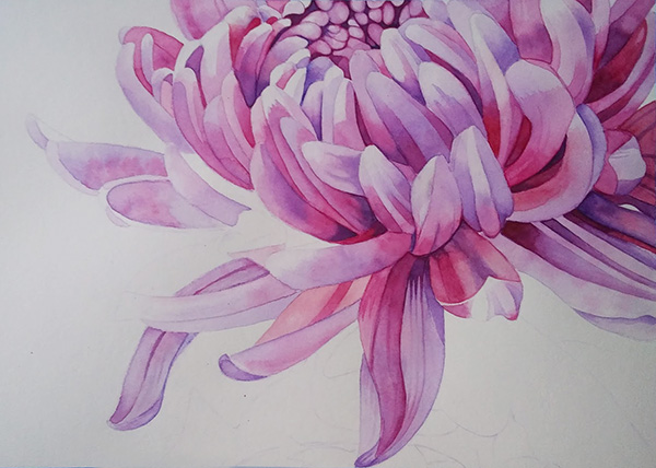

I’m using this project as a warm up and brush control exercise before I work on a personal piece. This process seems to be working. I think I’ll keep doing that — keep two projects going at the same time.
I’m also pondering size. I want to work bigger than this but this 8.5 x 11 size is really manageable — I can turn the board really easily when I need to for controlling edges and water. But as far as finished pieces, I’d like to get comfortable with up to 24 x 36. I’m getting ahead of myself tho. Focus.
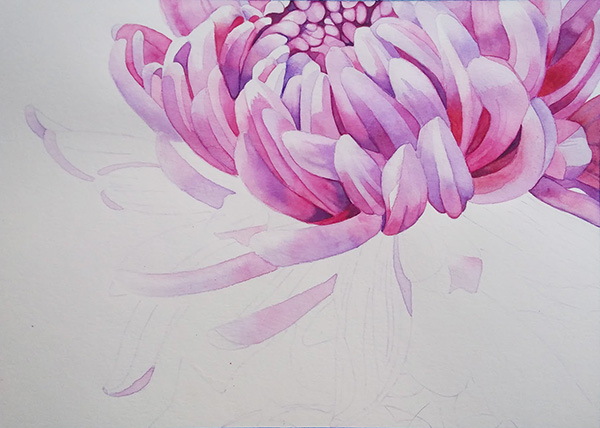
Adding the deeper values on the right side is helping “shape” the flower. This assignment like a puzzle. I’m hyper focused on rendering each petal to match the image. It’s only when I step back to see the overall form that it starts to come together. Whereas if I were painting in oil, I would be focusing on the large shapes first before diving deep into the details. Hmmmm. Is that the medium or is it because I’m not making the big decisions for this assignment — just rendering or is it this particular approach to watercolor?
I think with oil I can keep painting over forever so that helps. And the transparency of watercolor means I’m layering up from light to dark so it’s totally different. It’s kind of like a print in that I have to flip the way I’m planning a piece. Some people just totally go with it though and don’t plan.
What I learned:

What I’m discovering:

What I learned:
I couldn’t protect the highlights in the center. Even if I kept it dry and did the softening edges technique with the damp brush, it eventually spread to the center. If I had to do it over, I might use the masking fluid.
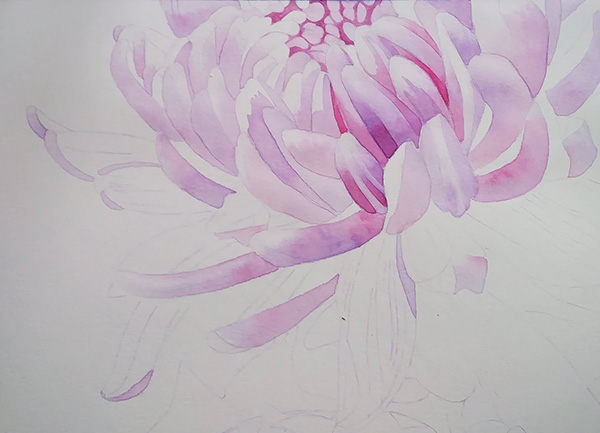
Stage 2: after adding some detail and painting the center

Stage 1 of assignment from Louise de Masi’s Skillshare class
Here’s where the rubber meets the road, where color mixing + water control + brush handling = actual painting! I’m learning so much, where to even begin?
I don’t want to think about drawing, composition, etc. yet so I’m following along with Louise de Masi’s Master Watercolor Techniques class on Skillshare so I can focus on painting technique.
Notes to self: I’m using Fluid hot press 140 lb. paper. Louise recommends a lot more brushes but I found that I could get into the teeniest corners as well as cover a whole petal with my #8. I used the flat bristle brush as she instructs, to clean up edges and mop up paint for highlights.
What I learned with the first wash:
by riasharon
I’m enjoying doing these exercises more and more and they serve as a nice warm up to a painting session.
Decided to use them not just as warm up but also see how different colors in my palette look in different concentrations. #1 is 708 and #2 is 533. Using scraps from sketchbooks to conserve paper.
Note for self: these were all done wet on dry.
I already see an improvement from my first set.
What I learned:
by riasharon
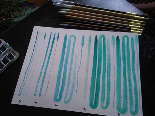
I bought this set of ink brushes a few years back. When I was working with gouache, I hated them. They were not stiff enough to control the paint because duh, that’s not what they’re for.
What I learned:
by riasharon

I have none (Denise Sodden’s lesson)
What I learned:
by riasharon
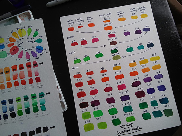
Secondary Colors (Dr. Oto Kano)
What I learned:
by riasharon
Just doing a lesson every day…
What I learned:
by riasharon

Here’s a study I did in 2016. It’s fine. I watered down gouache to make this illustration. It’s fine. But whyyyyyy?
by riasharon
It’s been a minute.
I’ve continued with my daily at practice, although a lot hasn’t happened in a sketchbook. I designed a garden, renovated a house, learned how to bake sourdough (like the rest of North America). My house is in a constant state of being painted. Finally, I got the itch to get back to making personal art. And when I did, I found myself butting up against my abilities.
What does that mean? For a long, long time I felt at a loss for subject matter — what I wanted to address or focus on through my art. Finally, I have a lot to “say” but can’t capture it the way I want because I don’t have enough mastery of my tools. So I’m putting myself through DIY art school.
I’ve been painting forever but mostly in oils. In actual art school, I focused on printmaking. But for many reasons, watercolor feels like the best medium for me right now. Problem is, I’ve taking exactly ONE watercolor workshop in my whole life.
It’s fun being a beginner. Anything is possible! It’s that whole new-backpack-fresh-new-notebook-back-to-school feeling. 🙂 I’m just going to post here along the way, (really) to document this journey for myself. I could keep an actual notebook but I’m “traveling light” these days.

12-color split primary palette from the Van Gogh pan set
What I learned: