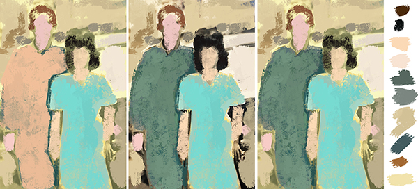
color study

composition study
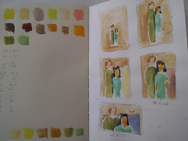
color studies in gouache
sketchbook

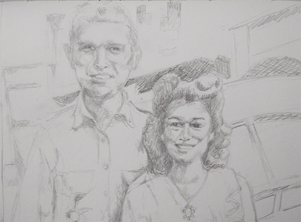
large sketch
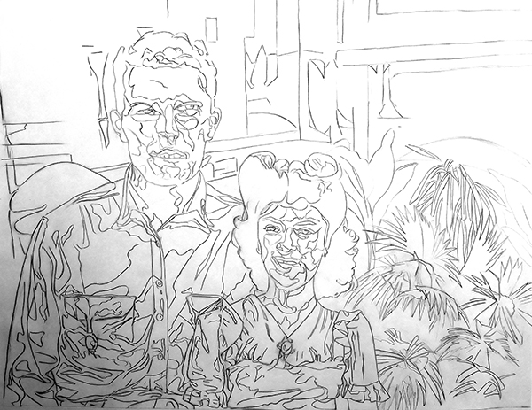
finished sketch


pondering creativity, process, and making art
by riasharon

color study

composition study

color studies in gouache

sketchbook

large sketch

finished sketch


by riasharon

Oct. 5: I’m going to set this aside and perhaps come back to it later
I liked it better at the glowy stage. Not sure what happened between then and now.

Happy with the sleeves and dark areas but struggled with the middle. Not sure if it’s salvageable.
Reflections:
I really like the idea of stylizing the work overall. It’s not photorealism like Rance Jones. There are aspects of my style that have been consistent for 30 years (see Siesta drawing from 1993).
But there’s a more graphic quality to it now. I can see the design influence for sure. The more formal qualities, the shapes on the face are the same as on the fabric. I like that. It’s almost like… yes, it’s all paint. And the rendering is so much more controlled after taking Louise de Masi’s one class. I’m going to do more because there’s no pressure there. I can keep focusing on technique.
I’m very pleased with this composition. That is also a style thing. All my paintings have really strong angles. I like using the angles to create focal points. I like the limited color palette. And the values that lighten as you go up but then the contrast in and around the face.
When I’m happy with the painting part, I want to scan it in and see what I can do with the background — what if I put it on a solid yellow background or what if I render the background in illustrator as flat shapes?
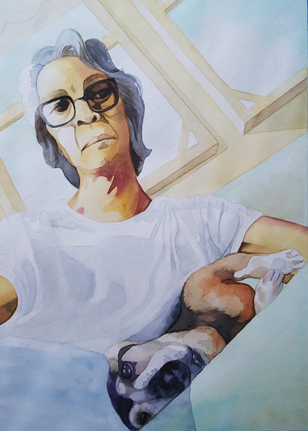
Darkening the face, the glasses, the hair

figure: 227; shadows 408, 366+662, 567; hair: 708; pants 533; outside window: 675 plus spots of 227; shadow of window frame: 408; couch: glaze of 756 with spots of 227
I kind of love the colors in this stage – so glowy!
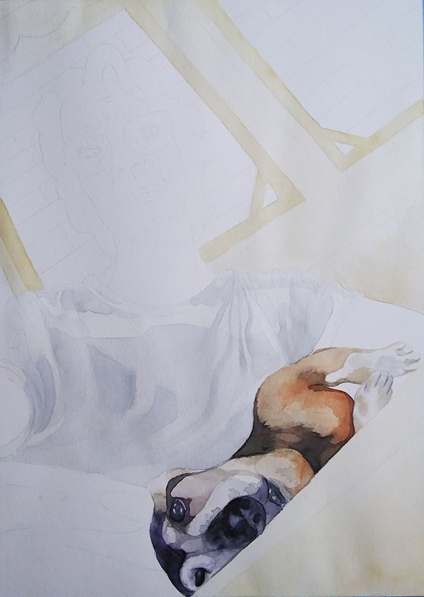
study #2: shirt wash: 708; background wash: 227, 234

dog: 408, 411, 708, 568, 339
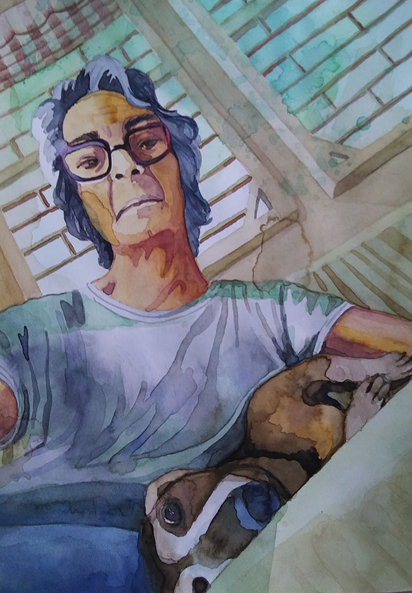
first study
Assessment: Good start. Love the color choices — the limited palette, the hues in the shirt and the greens in the background. The composition rocks — the strong angles, the weirdness of having the dog upside down with her eye right on the edge, the strong lines on the shirt, thelines in the windows. Love the splashes in the background
Water control sucks. Used the wrong brushes, especially in the shirt. The dog’s face is all messed up — couldn’t figure out the actual drawing.
Consider “melting” the curtain more into the background

inked line drawing

initial sketch

Reference photo